Key Takeaways
- Google has operated mobile-first indexing since 2019, meaning the mobile version of your site is the version Google uses to determine your rankings, not the desktop version.
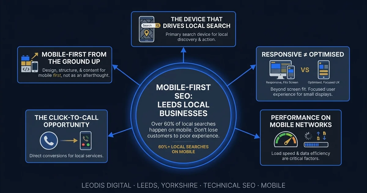
- Over 76% of local searches happen on mobile (BrightLocal, 2024), and for sectors like hospitality, trades, and emergency services the proportion is higher still.
- Mobile-responsive design (layout adjusts to screen size) is not the same as mobile-optimised design (site designed with mobile users' needs as the primary consideration).
- Touch targets should be at least 48x48 pixels, base font size should be at least 16px, and the phone number should be a tappable tel: link visible without scrolling on every page.
- Full-screen pop-ups on mobile are both frustrating for users and a direct Google ranking penalty under the intrusive interstitials policy.
The Device That Drives Local Search
Local search is mobile search. When someone needs a plumber on a Sunday afternoon, a restaurant for tonight, a solicitor for an urgent matter, or a web designer for a new business they are starting — they reach for their phone. Understanding how local SEO in Leeds works across both mobile and desktop search is the starting point for any visibility strategy. Google's own data puts mobile's share of local searches at 76% or higher (BrightLocal, 2024), and for sectors like hospitality, trades, and emergency services, it is higher still.
Google has operated mobile-first indexing since 2019. This means the mobile version of your site is the version Google uses to determine your rankings — not the desktop version you may have designed around. If your mobile and desktop experiences are significantly different, or if your mobile experience is simply a scaled-down version of a desktop-first design, the mobile version is what your rankings are based on.
For most local businesses in Leeds, this matters more than they realise.
The Difference Between Responsive and Optimised
There is a persistent and consequential confusion between a site that is mobile-responsive and a site that is mobile-optimised. They are not the same thing.
Responsive design means the layout adjusts to fit different screen sizes. This is the absolute minimum standard in 2026. A site that is not responsive is broken on mobile. But responsive design simply means the layout does not break — it does not mean the experience is good.
Mobile-optimised design means the site is designed with mobile users' specific needs and context as the primary consideration. The mobile experience is not an afterthought — it is the intended experience, and the desktop version is what scales up from it.
Specific mobile optimisation requirements:
Touch targets sized for human fingers. Buttons and links that are too small or too close together cause mis-taps and frustration. Google's guidelines recommend tap targets of at least 48x48 pixels with adequate spacing. A site where the navigation links are small text links packed closely together is a site that frustrates mobile users on every page.
Text readable without pinch-zooming. A base font size of at least 16px on mobile prevents users from having to zoom in to read body content. If your site requires zooming to read, users will not stay long enough to enquire.
Critical information above the fold. Mobile users in a local search context often want specific information immediately: your phone number, your core service, and how to contact you. If these are buried below a large hero image and three paragraphs of copy about your company values, the site is not designed for its actual use case — a prospective customer on a mobile phone who found you on Google and wants to know if you can help them quickly.
Mobile-friendly forms. Contact and enquiry forms need large input fields, appropriate keyboard types (numeric keyboard for phone fields, email keyboard for email fields), and no horizontal scrolling. A difficult-to-complete form on mobile is an abandoned form. Abandoned forms are lost enquiries.
Performance on Mobile Networks
Mobile users are frequently on slower and less consistent connections than desktop users at home or in an office. A site that loads in 1.8 seconds on fast broadband may load in 4.5 seconds on 4G and significantly longer in a low-signal area.
Testing performance only on fast connections produces dangerously misleading results. A business owner who opens their website on the office WiFi and judges it "fast enough" is not seeing what their customers on mobile networks in Leeds city centre are seeing.
Google's PageSpeed Insights simulates a mobile connection by default for the mobile test. If your site scores below 70 on that test, your real-world mobile performance is the problem, not the simulation. This is the performance level that Google uses to evaluate your Core Web Vitals and determine your local search rankings. Our technical SEO audit guide explains how these performance issues are diagnosed and prioritised in practice.
The Click-to-Call Opportunity
For service businesses, the most valuable conversion on mobile is often a phone call. A user who searches for an emergency plumber or an urgent accountancy question and finds a prominently displayed, clickable phone number is a high-intent lead who requires minimal friction to convert. The connection between mobile experience and conversion rates is explored in depth in our guide to how a slow website costs Leeds businesses money.
Your phone number should be:
- Prominently displayed on every page — in the header or just below it, visible without scrolling
- Formatted as a
tel:link so it is tappable on mobile, not just visible text - Placed before any lengthy content on mobile layouts, so it can be found immediately
Every pay-monthly website from Leodis Digital includes this as standard. The click-to-call opportunity is one of the clearest revenue connections between mobile experience and business outcomes.
Mobile UX Patterns That Cost Conversions
Beyond the structural design issues, there are specific user experience patterns that consistently reduce mobile conversion rates for local businesses:
Pop-ups and interstitials. A full-screen pop-up that appears immediately when a mobile visitor lands on a page is both frustrating to dismiss and a direct Google ranking signal — Google penalises sites with intrusive interstitials on mobile, particularly if they block content before the user has had a chance to engage. If you use pop-ups for newsletter sign-ups or cookie consent, ensure they do not cover the full screen on mobile and can be easily dismissed with a single tap.
Sticky headers that are too tall. A header that occupies 20% of the mobile screen height while the user is scrolling through content leaves insufficient vertical space for the actual content the user is trying to read. Sticky headers should be minimal — a logo and navigation icon — not a full desktop-width header compressed onto a phone screen.
Auto-playing video. Auto-playing video in a hero section adds to load time, consumes mobile data, and disrupts the user experience. On mobile, where data costs are real and connection speeds variable, auto-playing video is a significant performance cost for uncertain conversion benefit.
Chat widgets. Third-party live chat widgets frequently load synchronously, adding seconds to mobile load times. If you use a chat widget, ensure it loads asynchronously and does not block the rendering of the main page content.
Non-native date pickers. Booking forms that use custom-built date pickers instead of native mobile inputs are often difficult to interact with on a touchscreen. Using native HTML date inputs triggers the device's built-in date picker, which is optimised for the operating system and far easier to use than any custom implementation.
Mobile-First from the Ground Up
The correct approach to mobile design is to design the mobile experience first and scale it up to desktop — not to design a desktop experience and compress it down to mobile. These are not equivalent processes.
A desktop-first design adapted to mobile produces a site that technically does not break on a phone but often has the wrong information hierarchy, too much content above the fold, small touch targets, and performance issues from assets optimised for large screens. Getting the on-page SEO fundamentals right on mobile-first pages — correct heading structure, appropriate content depth, and clear calls to action — compounds the ranking benefit of fast load times. A mobile-first design produces a site that is immediately useful on the device where most of your prospective customers will find you.
At Leodis Digital, every website we build — including all pay-monthly websites — is designed mobile-first. The mobile layout is the primary design consideration. The desktop layout scales up from it. This is not just a philosophical preference — it is the correct approach for any local business whose customers predominantly search on mobile.
Mobile performance feeds directly into Core Web Vitals, which are a confirmed Google ranking signal. For the technical detail on these metrics, see our Core Web Vitals guide for Leeds businesses. For a practical guide to diagnosing and improving your PageSpeed scores, see our PageSpeed practical guide.
If you want to know how your website is currently performing on mobile — and what it is costing you in local search visibility — get in touch with Leodis Digital for a free assessment.
Frequently Asked Questions
Are pay-monthly websites from Leodis Digital built mobile-first?
Yes, by design. Every website we build starts from the mobile layout — the phone experience is the primary design, from which the desktop version scales up. This is the correct approach for local businesses, where the majority of visits arrive from mobile devices. The result is a site where the mobile experience is not an afterthought or a scaled-down version of the desktop — it is the intended experience.
What is the difference between mobile-responsive and mobile-optimised?
Responsive design means the layout adjusts to fit different screen sizes — the absolute minimum standard. A site can be technically responsive but still provide a frustrating mobile experience: tiny touch targets, text requiring zoom, critical information buried below the fold, forms that are difficult to complete on a touchscreen. Mobile-optimised means the site is designed with mobile users' needs as the primary consideration — fast, immediately useful, with clear calls to action and touch-friendly interactions. These are different things, and the distinction matters significantly for conversion rates.
How do I test whether my website performs well on mobile?
The most reliable test is to use your website on a mid-range Android phone (one to three years old) on a 4G connection. This represents a large portion of your real user base. Note what feels slow, what is difficult to tap, and whether the most important information — your phone number, services, and how to contact you — is visible without scrolling. Also run your URL through Google PageSpeed Insights (pagespeed.web.dev) and review the mobile score, which simulates a realistic mobile connection. A score below 70 on mobile indicates structural performance problems.
Why does my website score much lower on mobile than desktop in PageSpeed?
PageSpeed Insights simulates a mid-range mobile device on a 4G connection for the mobile test. Mobile processors are slower than desktop processors, mobile connections are less stable than fixed broadband, and mobile users have less patience. A gap of 20 to 40 points between desktop and mobile scores is common but not acceptable — the mobile score is the one that affects local search rankings because Google uses mobile-first indexing. Closing that gap requires fixing the structural performance issues: image optimisation, reduced JavaScript, faster server response times.
Found this useful? Share it.