When Jane Hartland came to us, she had never had a website before. She had been practising as a counsellor for several years — building experience through voluntary work, completing her Level 4 Diploma in Therapeutic Counselling — but her online presence was limited to a profile on a counselling directory. That had been enough to get started. It was no longer enough to grow.
Compassionate Space Counselling is an online-only practice. Jane works with adults across the UK, offering person-centred, trauma-aware counselling via secure video calls. The name is deliberate: the work is about creating a space that feels genuinely safe, not clinical or transactional. The website needed to do the same.
The Starting Point
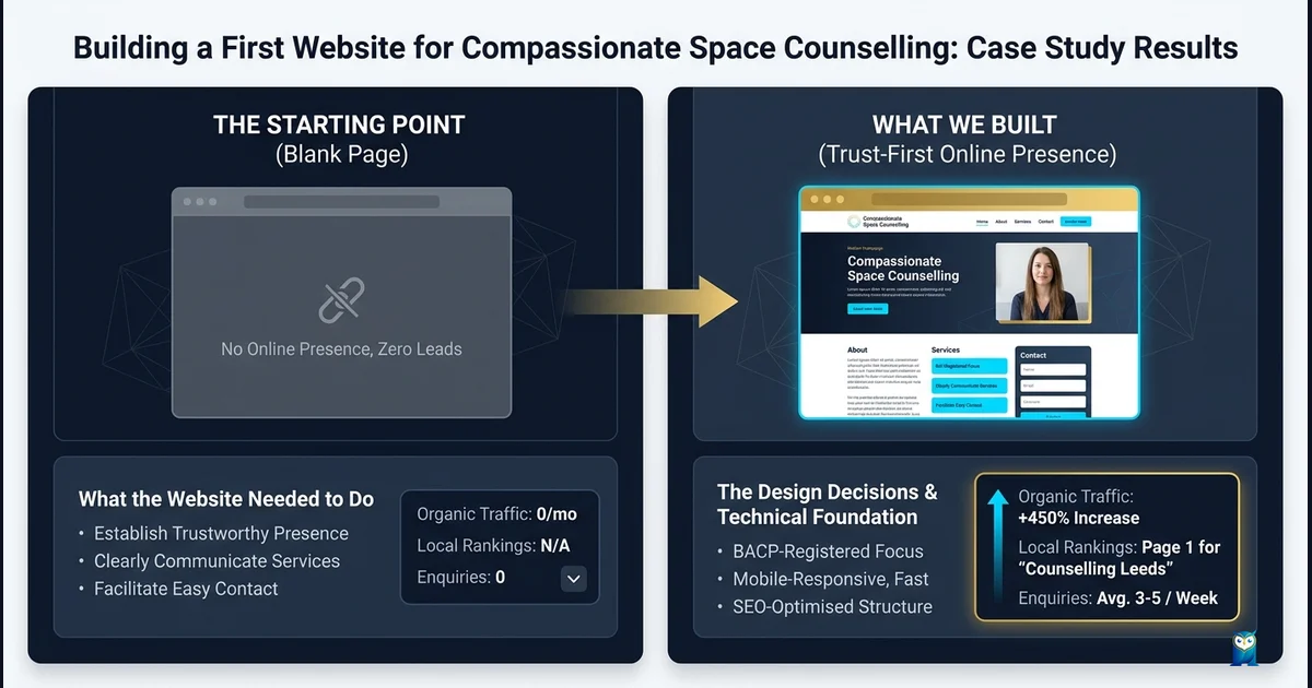
Jane was not coming to us with a problem to fix. There was no existing site to rebuild, no broken experience to diagnose. What she had was a blank slate and a very clear sense of what her practice stood for — and a need to translate that into something a complete stranger could land on and feel, in the first thirty seconds, that this was a place they could trust.
That is a different challenge from a technical rebuild. It is a design and communication problem, and it requires a different kind of patience.
The brief was straightforward in outline. Build a first website for an independent counsellor. Make it feel warm but professional. Explain clearly what Jane offers, who she works with, and how someone takes the first step. Do not make it feel like a transaction.
In practice, getting that right took time.
What the Website Needed to Do
We identified four core objectives early in the process.
Build trust before it is asked for. Anyone searching for a counsellor is likely doing so at a difficult moment. They are not in a position to read dense blocks of text or work through a confusing navigation structure. The site needed to surface the most important trust signals — qualifications, years of experience, professional supervision, insurance — quickly and without the visitor having to hunt for them.
Represent Jane's voice and approach accurately. Person-centred counselling is a specific modality, and Jane's practice has a specific character. The site needed to feel like her, not like a generic therapy listing. That meant the language, the imagery, the colour choices, and the overall tone all had to be calibrated together. A site that looks the part but sounds wrong is worse than nothing.
Remove the practical barriers to making contact. Many counselling websites ask prospective clients to submit an enquiry without giving them the information they need to feel comfortable doing so. Session fees, session format, availability, what the first call actually involves — these details should be on the site, clearly stated, so that someone can make a considered decision to reach out rather than a leap of faith. The free 20-minute introductory call Jane offers is one of the most important things on the site. It needed to be prominent.
Be technically sound from the start. Jane's practice operates entirely online. Her website is her entire digital footprint. It needed to load fast, work faultlessly on mobile, meet accessibility standards, and carry the structured data that helps search engines understand what the site represents and who it serves.
What We Built and Why
The site is a single, comprehensive homepage. That was a deliberate choice. Jane's practice does not have multiple service lines, satellite locations, or a content strategy requiring dozens of pages. What it has is one clear offer, delivered carefully. A single well-structured page is the right architecture for that.
We worked through the page structure as a sequence of decisions a prospective client needs to make. First: is this person qualified? Second: does this feel like my kind of counsellor? Third: what would it actually involve? Fourth: what would it cost? Fifth: how do I take the next step without committing to something I am not ready for?
The hero section answers the first question before anything else is read, with her qualification shown plainly and a headline that states the offer plainly: a compassionate space to be as you are. No jargon. No promises about transformation. Just clarity.
The trust strip follows immediately — three concise signals: professional practice, confidential space, working at your pace. These are the things anxious prospective clients most need to hear. We put them above the fold.
The About Jane section does more than list credentials. It explains her background, her voluntary work history, the supervision structure she operates under, the insurance she holds. Credentials are table stakes. What builds trust is the specificity behind them — the fact that Jane works under a BACP-accredited supervisor, that she has worked with young people through Place2Be and Evolving Minds, that she has taken the professional infrastructure of her practice seriously at every level.
How I Work covers Jane's three core principles as a practitioner: the person-centred approach, trauma-aware practice, and clear professional boundaries. Each is explained in plain language — not the language of training manuals, but the language Jane would actually use with a new client. Getting that right required working closely with Jane on drafts and being willing to revise until it felt honest rather than performed.
What I Can Help With covers the six primary areas of focus: anxiety and stress, low mood and depression, trauma and abuse, bereavement and loss, self-esteem and identity, and the catch-all of other difficulties that covers the complexity of real human experience. The framing matters here. Each item is a description of a lived experience, not a clinical category. Someone reading it should be able to see themselves.
What to Expect maps the four-step process from enquiry through to ongoing work. This section exists to remove the mystery from what can feel like an intimidating process. What happens after you send an email? What is the introductory call actually like? What happens in the first session? How do you know if you want to continue? Answering these questions in advance reduces the activation energy required to reach out.
Fees and Practical Details states the numbers plainly. Sixty-minute sessions. Standard fee of £50. Concession rate of £35 for emergency services staff and students. Available Monday to Saturday by arrangement, UK-wide via video call. No small print. No soft-pedalling the cost. People should know what they are considering before they commit to a conversation.
The FAQ section addresses the questions people most commonly have but often feel reluctant to ask. Does Jane keep records? What happens if I am in crisis between sessions? Do I need a GP referral? Is counselling the right option if I am not sure what I need? These are real questions that real people are Googling at midnight. Answering them on the site is both practically useful and a demonstration that Jane understands her prospective clients' anxieties.
The Design Decisions
The visual language of the site was built around warmth and groundedness rather than clinical minimalism or aspirational lifestyle imagery. The colour palette — berry, sage, cream, dusty rose — reads as considered and human. The typography pairs Playfair Display for headings (elegant but not cold) with Lato for body text (readable and direct). Botanical imagery runs throughout: plants, leaves, the quiet suggestion of something organic and alive.
None of these choices are accidental. The visual language of a counselling website is itself a form of communication. It signals before a word is read whether this feels like a place that might understand you. We wanted the site to feel like walking into a calm, carefully tended room — not a hospital waiting area, not a luxury spa.
Jane's logo uses a botanical mark that carries the same language through to the brand identity. It is simple enough to work at small sizes, distinctive enough to be memorable.
Technical Foundation
The site is built in static HTML and deployed via Cloudflare Workers Assets. The decision to go static rather than CMS-backed was deliberate. Jane does not need a content management dashboard. She needs a site that is fast, secure, and maintenance-free. Static HTML delivers all three.
PageSpeed scores are consistently in the high 90s on both mobile and desktop. There is no JavaScript overhead beyond the cookie consent for Google Analytics. The site loads in under a second on a standard mobile connection.
Accessibility was treated as a design constraint from the beginning, not a checklist item at the end. The site targets WCAG 2.2 AA compliance: sufficient colour contrast throughout, keyboard navigable, properly labelled interactive elements, skip-to-content link for screen readers.
Schema markup covers the full range of structured data relevant to a professional service: ProfessionalService, Person, Service, FAQPage, WebPage, and BreadcrumbList. This gives search engines a clear, machine-readable understanding of what the site represents and who it is for.
What the Process Looked Like
Because this was Jane's first website, we spent more time than usual in the early stages of the project not building anything. We talked through what she wanted the site to communicate. We looked at examples of sites that felt right to her and, importantly, sites that felt wrong. We drafted copy together and revised it until it sounded like Jane rather than like a website.
That process is slower than simply speccing a build and executing it. It is also the part that makes the difference between a site that is technically correct and a site that actually works for the person it represents.
Jane came to the process thoughtful and clear about her values. Our job was to translate that clarity into structure, language, and design — and to make sure we understood what she was building toward well enough to make good decisions on the things she did not need to think about.
The Launch
Compassionate Space Counselling launched in July 2026 at compassionatespacecounselling.co.uk.
It is a first website. The content strategy, the potential for location-specific pages, the longer-term SEO architecture — those are future conversations. For now, the site does its primary job: it gives Jane a professional home on the internet that she is proud to send people to, and it gives prospective clients everything they need to decide whether to reach out.
That is where every good website starts.
If you are a sole practitioner, therapist, or independent professional who has been making do without a proper website — or who has a site that no longer represents where your practice has got to — we would be glad to talk.
Get in touch with Leodis Digital about what a website for your practice might look like.
Frequently Asked Questions
Why is trust signalling so important for a counselling website?
People searching for a counsellor are usually in a vulnerable position. They are assessing not just your qualifications but whether you feel safe — whether your tone, your structure, and your clarity all suggest that you are someone they can open up to. A website that looks rushed, cluttered, or difficult to navigate introduces friction at exactly the wrong moment. Conversely, a site that is calm, clear, and honest about what to expect gives prospective clients the confidence to take the next step. For regulated practitioners like BACP members, making credentials visible and easy to verify is also part of professional responsibility.
What should a counselling website include?
At minimum: a clear statement of who you work with and what you specialise in; your professional credentials and membership bodies; session format and fees (including any concessions); a practical explanation of what to expect before, during and after a first session; an FAQ that pre-empts the questions anxious clients are reluctant to ask; a simple, low-commitment way to make initial contact; and crisis signposting for people who need immediate support. Many counselling sites skip the practical details — fees, session length, availability — which forces prospective clients to send a cold enquiry just to get basic information. That is a barrier you can remove.
Does an online-only counselling practice need a website?
Yes — arguably more so than a practice with a physical location. A physical space provides sensory cues about professionalism and atmosphere. An online practice has only its digital presence to carry that weight. A well-built website does the job a waiting room and receptionist would otherwise do: it answers questions, establishes trust, and makes the process feel manageable. It also gives you a stable, professional home that you own and control — independent of any directory listing or third-party platform that could change its terms at any time.
How long does a first counselling website take to build?
It depends less on technical complexity and more on how clear the practitioner is about their voice, approach, and what they want to say. The build itself is not the slow part. The slow part — the useful part — is working out what the site needs to communicate and in what order. For practitioners who have never had a website before, that process can take a few weeks of conversation, drafting, and refinement. Rushing it produces a website that looks finished but does not actually represent you. We would rather take the time.
What is the difference between a static HTML website and a WordPress site for a small counselling practice?
WordPress gives you a CMS — a dashboard for editing content without touching code. For a large, frequently-updated site that is genuinely useful. For a small counselling practice whose core content changes rarely, it introduces unnecessary overhead: regular plugin updates, security vulnerabilities, hosting requirements, and performance overhead. A well-built static HTML site has none of those maintenance burdens, loads significantly faster, and can be just as easy to update when changes are needed. For a solo practitioner who wants a reliable, low-maintenance site, static HTML is often the better fit.
Found this useful? Share it.