The Starting Point
Buttercup Children's Trust was doing important work for seriously ill children and their families, but the previous website no longer matched the quality or clarity the charity needed online. The archived version was functional in the narrowest sense: the pages existed, the information was present, and visitors could eventually find donation and application routes. But it behaved like an old brochure site, not a modern charity platform.
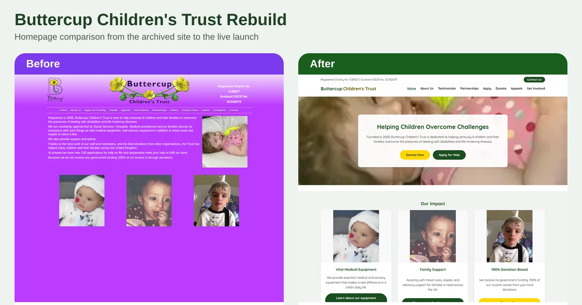
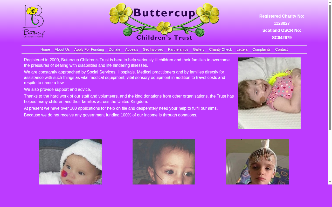
The first impression was the problem. The homepage opened with a saturated purple background, a long block of copy, and a navigation bar that asked the visitor to do too much interpretation. There was no strong first-screen hierarchy for the two most important actions: giving support and requesting help. For a charity site, that is not a minor UX issue. It directly affects how easily families, referrers, and donors can act.
More importantly, the technical foundation had fallen behind. The archived homepage still used the generic <title>Home</title> and a placeholder meta description of Meta Description, which meant the most important page on the site was giving search engines almost no meaningful context.
What the Rebuild Needed to Solve
This was not a project about making the site look newer for its own sake. The rebuild had four specific objectives.
1. Make the charity's purpose clear immediately
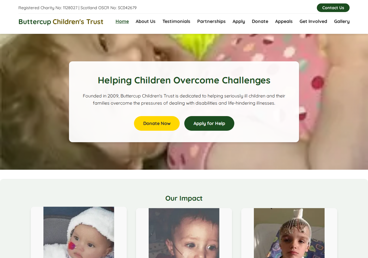
Visitors needed to understand, within seconds, who the charity helps and what kind of support it provides. The new homepage now does that with a direct headline, a short explanatory paragraph, and a cleaner first-screen structure.
2. Prioritise the primary user journeys
The previous site contained the relevant pages, but the routes were buried inside a more general brochure-style layout. The rebuild brought the key actions forward: Donate Now, Apply for Help, Appeals, Testimonials, and Get Involved are now clearly visible and framed as distinct journeys rather than buried options.
3. Improve trust, readability, and mobile use
Charity websites need warmth, but they also need restraint. The old site used colour and imagery heavily, yet the reading experience remained difficult because the layout lacked hierarchy and space. The rebuild introduced stronger contrast, more deliberate spacing, card-based content blocks, and cleaner typography so the site feels more credible and easier to navigate on both desktop and mobile.
4. Fix the search and sharing baseline
The live site now includes a descriptive page title, a proper meta description, a canonical URL, Open Graph and Twitter metadata, and Charity schema markup. Those are not decorative extras. They are the technical signals that make a site easier to understand, easier to share, and easier to maintain properly.
What Changed in Practice
A clearer homepage structure
The old homepage tried to do everything in one pass: explain the trust, present photography, show the charity numbers, and expose the full navigation at once. The result was visual noise.
The new homepage is structured in a more disciplined way. The header carries the registration details and a clear contact route. The hero explains the mission in plain language. The call to action buttons separate the two main intents cleanly: people who want to contribute and people who need support.
That sounds simple because it should be. The point of a homepage is not to impress a designer. It is to reduce friction for the visitor.
Better content hierarchy
The archived homepage relied on a single paragraph block to explain almost everything. The rebuilt version breaks the charity's offer into recognisable sections such as impact cards, support themes, and next-step actions. That shift matters because people scan before they read. A site that cannot be scanned efficiently loses attention before the message has landed.
This is especially important for charities, where the audience is mixed: some visitors are distressed families looking for help, some are professionals referring cases, and some are donors deciding whether the organisation feels credible and legitimate.
A stronger visual trust signal
The live site keeps the Buttercup identity, but with a more controlled palette and a more modern layout system. The result is more professional without becoming cold. The archived site had sincerity, but not enough structure. The rebuilt site has both.
That matters commercially and operationally. Trust is not an abstract branding concept for a charity website. It affects whether somebody donates, whether somebody refers a family, and whether somebody believes the organisation can deliver what it promises.
A better technical foundation
As of 14 May 2026, the live homepage serves a descriptive title of Buttercup Children's Trust | Supporting Seriously Ill Children, a specific meta description, social sharing metadata, and Charity schema with organisation details. The page also preloads a WebP hero image and exposes a valid XML sitemap.
The archived version did none of this well enough. It used a generic title, placeholder description text, and a static template approach that made the site feel older to both users and search engines. The rebuild fixes the baseline so the site is no longer asking Google or social platforms to guess what it represents.
The Before and After Evidence
The screenshots below were captured on 14 May 2026: the "before" from the local archived version of the old site, and the "after" from the live site at buttercupchildrenstrust.org.uk.
The contrast is straightforward to see.
- The old site leads with a dense text block and broad navigation.
- The new site leads with a direct mission statement and immediate action buttons.
- The old site feels like an untouched legacy template.
- The new site feels like an active, maintained charity website with clearer routes and stronger legitimacy signals.
This is the kind of difference a rebuild should create. Not novelty. Not trend-chasing. Clearer understanding, lower friction, and a better technical foundation.
Why This Matters Beyond Aesthetics
It is easy to talk about redesigns in visual terms because screenshots make the change obvious. But the real value is operational.
For Buttercup Children's Trust, the rebuild creates a site that is better aligned with the actual work of the charity:
- families can identify the support route faster
- donors are given a clearer prompt to contribute
- referrers can understand the organisation more quickly
- the charity has a platform that is easier to maintain, extend, and optimise
That final point matters more than most organisations realise. A rebuild is only successful if the site remains healthy after launch. The old version had clearly been left to age in place. The new version gives the trust a far better base for future updates, appeals, fundraising campaigns, and content additions.
The Broader Leodis Digital Lesson
This project reflects a pattern we see regularly, particularly with charities and smaller organisations: the website is not broken enough to force an immediate replacement, but it is underperforming quietly every day. Messaging is unclear. Metadata is weak. Key actions are present but not prioritised. The site still "works", so the decline is tolerated longer than it should be.
That is exactly where rebuilds become valuable. Not when a website has completely failed, but when it is no longer helping the organisation do its job effectively.
For the wider framework behind this kind of work, see our guide to charity SEO in 2026, our article on website redesign SEO risk, and our breakdown of why website maintenance matters. If you are reviewing an older site and can already see the same symptoms, the technical and structural problems are usually deeper than the homepage alone.
If your organisation needs a website that is clearer, easier to manage, and technically stronger from day one, get in touch with Leodis Digital.
Frequently Asked Questions
Why rebuild the old Buttercup Children's Trust site instead of patching it?
Because the old site had structural problems, not just cosmetic ones. The homepage title was simply "Home", the meta description was still a placeholder, the layout relied on an ageing static template, and the key actions for donors and families were not prioritised in the first screen. Retrofitting clarity, search metadata, mobile usability, and a modern content hierarchy into that foundation would have been less efficient than rebuilding it properly.
What changed most in the rebuild?
The biggest change was information hierarchy. The new homepage explains the charity's purpose immediately, brings "Donate Now" and "Apply for Help" into the hero, and turns the trust's work into clear sections instead of a single dense block of copy. Alongside that, the rebuild adds structured metadata, social sharing tags, a sitemap, and a clearer mobile navigation pattern.
Does technical SEO matter for a charity website?
Yes. Charity websites still need to be understood by search engines, shared properly on social platforms, and found easily by families, referrers, donors, and volunteers. Clear title tags, descriptions, canonical URLs, schema markup, and crawlable navigation are not commercial extras. They are part of a professionally built website.
Can Leodis Digital rebuild charity sites on a fixed monthly basis?
Yes. For charities especially, a fixed monthly website model is often the more practical option because it spreads cost, includes maintenance, and avoids the pattern where a site is launched and then left untouched for years. Our wider approach is covered in our charity SEO and website guidance for third-sector organisations.
Found this useful?
Share it with your network on Facebook.